Wednesday, November 18, 2009

Moving on from mid-review


After meeting with Karl yesterday, I feel like the mid-review has now actually been completed and our group is much more certain of what steps need to be taken between now and the final review. Some of the criticisms of our project from the mid-review:

- Creating a more solid premise for placing the public programs on top of the light-seeking classrooms. For this, the reviewers suggested playing up the idea of our site as a "vibrant public space" that is easily accessible from the street, without having to travel through school spaces to get to our gym, library, etc.

-Look at our sections programmatically and see how we can relate them to each other. Also, creating more cohesive plans that read more clearly from floor to floor (and also since one of our purposes for the project is its construction advantages, the classrooms have to rely on each other for structure).

-Playing with wall/window thicknesses and materials

-Looking at where our public entrance is; is the west alley an ideal place for drop-off/pick up? Perhaps we should look at the space underneath the auditorium, which is lifted up and could provide a protective cantilever.


Yesterday, we presented Karl our work from the review as well as some work we had done over the weekend. One of the items we had was this diagram below, which explains a possible transition in where the main circulation will take place. This could include a skywalk of some sort that would span over our inner courtyard. Karl suggested unifying some of the elements in plan so that they didn't appear to be floating or placed by default, such as our egress stairs on both of the west corners. He also agreed with our assessment that we need to expand our exterior space, but this will be tricky to work out while keeping our classrooms at the minimum size. We'll see how that endeavor goes.


For the final review, we've started thinking about ways in which we can represent our building that will read the most clearly on the wall. For the mid-review, we only had plans, sections, the model and a few diagrams, but we know that renderings, more in-depth diagrams, and perhaps perspectival sections will be that much more helpful to the reviewers and anyone examining our project. We started practicing with V-Ray over the weekend, and now we feel that we know enough of it to make a decent rendering-- just enough to give the viewer a sense of our building at the human scale. Also, we know that having a clean Rhino model will go a long way in producing many informative drawings and diagrams, so that is something that we will strive for in the final push.

Sunday, November 1, 2009

A bit of an update on the past week or so of our work:


This was our first physical model that attempted to place all of the public spaces (gym, auditorium, library, administrative center) on top of the classrooms. It was a model that the three of us attempted to work on simultaneously, which was both beneficial and difficult at different times in the process. We liked how we were able to achieve an upward sloping yet disconnected surface running from the southeast to the northwest corner, and using the shapes of the auditorium and gym to help dictate this. Also, we were happy with how the bigger buildings helped to insulate the carved-out exterior spaces against the surrounding trains. Some parts we weren't so happy with, such as the form of the southern facade and the snake-like path of the northwestern region. We also knew that we would have to open up some spaces for light wells once we began inserting program.

At our desk crit, Karl was happy with the folding form occurring on the eastern facade, and suggested we employ it more in order to begin discerning the public program on top from the classrooms and hallways below. He also suggested using the light well cut out of the building directly north of ours as some sort of formal inspiration or influence on our design. We set out to create model 2.0:


We were much happier with this version, and I think also just happy in general to be building on one idea. Previously we had been moving in all different directions, so it was good to start creating iterations of a similar theme. The idea of folding became more prevalent in this model, as we peeled the auditorium up off of the main floor to heighten the sense of separation in programs. The exterior space running through the middle of everything also became more defined in this version, and we think it might be a pretty successful and enjoyable outdoor area, given its environmental circumstances. The southern and northwestern regions became more refined as well when we started picking locations for particular light wells and considered how they would function programmatically. The drawbacks from this model were the symmetrical nature of the gym, which kind of just happened incidentally, and also a few formal details which Karl discussed with us at our desk crit on Thursday. Currently, we are working on some detailed plans and sections to help us hammer out some of the specifics of the program.

On another note, there have been a few projects I've found while browsing the internet which are somewhat relevant to the ideas we've been working through.


(Image from http://archidose.blogspot.com/2008/10/from-mirage-city-to-taekwondo-park.html)

This first one, a proposal for a cultural Taekwando center in Korea, is a very formally reciprocative project which responds to its surrounding landscape while carving out some unique interior spaces. I thought its sloping nature and the way it folds through the site were similar to the angled site we're envisioning, and also the way we've imagined our folds and twists as a response to the imposing urban Chicago site we're building on.


(Image from http://www.inhabitat.com/2009/10/13/acme-united-nations-memorial-space-inspired-by-cells/)

This is a rendering of a proposed building at the site of the United Nations Peace Park in Chungju, South Korea. It was only a contest entry and it didn't win, but I find its use of irregular hexagonal cells to be exciting. We've been looking at ways to change up the normal rectangular cells that are normally used in classrooms, but we don't want it to be an arbitrary move solely for the sake of creating new geometries. In this idea, the method seems to genuinely work, and the subtraction of cells makes for an interesting exterior space that weaves through the building.


(Image taken from http://designshrine.net/2008/06/26/ae5-folding-facades/)

This last image is a restaurant in Vienna, which makes the folding surface an active part of its form. It can either be a completely vertical glass window, or folded up to form an overhang for patrons outside. This variable functionality of the folding surface is something I think would be worth pursuing once we start getting into the details of our building, and it could make our structure much more dynamic and engaging to the public.

That's all for now, but once we finish our plans and sections and our slight re-design of the model in general, I'll post some more images.

Thursday, October 29, 2009

Chicago revisited

I finally downloaded the pictures I took in Chicago while we were there for our class trip, and so I figured I would upload some of the more interesting/relevant shots here.


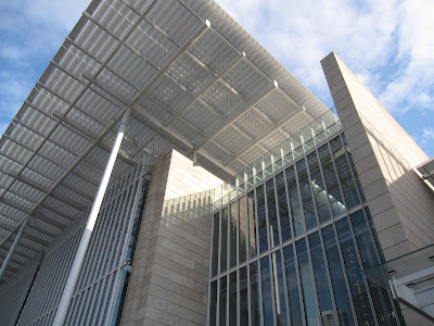
This is a picture I took at the Art Institute of Chicago viewing its newer wing, and I found the different materials and structural techniques to be very interesting in terms of how they allowed light to travel through them or reflect off their surfaces. As we get more in depth into our project, this is definitely something to be considered when we be begin employing various materials.


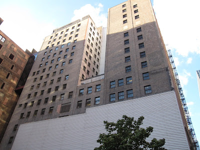
This picture is taken from our site, viewing the structure directly to the north of our building. There are a few items of interest relating our site and this building we are looking into: first, finding a way to incorporate the indented light well in this structure into our design through some sort of visual connection. Also, another issue we might run into eventually is the few exposed windows on the lower level of this building, because we don't want to build directly over them since we'll already be blocking a significant portion of sunlight.


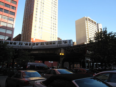
Here was the big surprise of our trip: the L trains running adjacent to our site. We previously thought the south and east borders of our site were open and exposed to good amounts of daylight. As it turns out, the L tracks not only cast a sizeable shadow over our site, they also create a great deal of noise for the site, which is pretty constant. This realization has made us treat the site differently: Classrooms must be insulated away from the tracks to keep quieter noise levels, and horizontal light sources are at a premium, meaning that much of our light will have to be drawn from directly above.


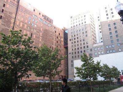
We saw this southeast corner as the busiest location of the site (intersection of the two main streets, corner of the L), so we became very interested in the view from this spot. We want our building to have a bit more of a human scale near this corner of the sidewalk, and from this location moving towards the northwest corner the building will slope upward following a progression of public programs. I will update this weekend on our project, which will hopefully illustrate these concepts more clearly.

Wednesday, October 21, 2009

Catching up

So I have failed to keep up with this blog, which has left me with a great deal of information and work that has been unposted here. I will try to overview most of the past month's important work here, and in the future I will be more timely with the blog in order to keep it updated with my most recent work.

Wasting no time:

We began with the Digital Project shadow models, which were helpful in seeing how sunlight affects our site throughout the day and during different times of year. My models essentially look the same as many of my classmates', but I began to examine the idea of how the sun's rays could directly impact the shape of our site or building:


Although it was a very abstract first attempt, using the sun to shape our building has become one of the main objectives this semester.

When we began looking at our building more specifically, I tried observing different precedents in how buildings (and more specifically school buildings) interact with the sun for optimal lighting scenarios.
A classroom making good use of sunlight, without too much resulting glare:

(Image taken from http://www.green-technology.org/green_technology_magazine/chps8.htm)
Versus a gym area with a problematic relationship with the sun, where it seems that glare or too much direct light would become an issue:

We began to think about forms that could work with our program and our objective of harnessing sunlight where necessary. The model below looked at using a curve along the southern facade in order to maximize sunlight throughout the day.


After working through several variations, we began focusing on an idea that employs a series of light wells and slits in the building facade. One of our final models for our first review focused on the light-well aspect of the building:


Since that review, we have tried a few different approaches to refining the light-well model. One approach looked to incorporate a mix of slits, light wells, and angled surfaces to bring light to the interior:


Another approach looks at the idea of "parascopes" bringing light to the interior. This idea became more prevalent when we saw our site for the first time and realized that the train tracks would not only block additional light, but be a source of loud, distracting noise as well.


We are now looking at reconciling these two ideas. By using the parascopes and light wells to draw light into the withdrawn classrooms, we hope to buffer the classes from the extremely loud exterior while providing as much sunlight and indirect light as possible. Another current focus of our project is looking at the building in plan, in order to configure the classrooms in a way that light wells can maximize the light being channeled to them.


Organizing the layout of our building is a primary concern, and perhaps moving away from the traditional box arrangement of classrooms would be an ideal solution. We are looking at various geometries that could result in a more unique school experience. The description of this proposed school project in Nova Scotia shows an interesting way of distributing a cellular arrangement of classrooms: http://www.misosoupdesign.com/feidad/NewMediaSchool/. Their exact method of determing room sizes and geometries might not be ideal for us, but it is a thought-provoking way of splitting up the monotony of a traditional hallway-classroom relationship, and hopefully we can do something similar with our program.
So, that was way too much for one post, but it is a general sampling of what I've done so far this semester. As I said before, I'll be able to be more specific with our project as we move forward from here, and I'll be sure to keep this blog updated with our progress.

Wednesday, September 16, 2009

Tutorial Three

I took this screenshot after finishing the tutorial. Notice the sweet color scheme.


And here's a couple of sections that I took from the second cube.

Monday, September 14, 2009

Tutorial Two


As I pushed the limits of the plan, error messages became much more frequent. However, I was still able to achieve some drastic results in the appearance of the 3-D image. If I were to do this again, I might make use of a simpler plan, since this one became a bit difficult to manage near the end of the process.

By making some minor alterations in the plan, one can already see the difference in both the overall surface appearance and the size of the holes in the skin.

Using the plan I created in the first tutorial, I projected some of the associations into the third dimension. To create punctures in the surface, I extruded triangles that I also based off of the original plan so that they would be associative as well.

Tutorial One

This was about as far as I could bend the associations without forcing the drawing outside of the bounding box. The altered plan looks nothing like the one I started with, even though it uses all the same lines.

I drew some construction lines through the original plan and made them coincident with certain vertices. It only took a few construction lines to start seeing a major difference in how my plan appeared.

This was the plan that I started with. I wanted to begin with rigid, orderly geometries and see how far I could manipulate them.